AYTO. GUADALAJARA

🏆
INDIGO DESIGN AWARDS 2026
Bronze winner in the BRANDING category for non-profit organizations.
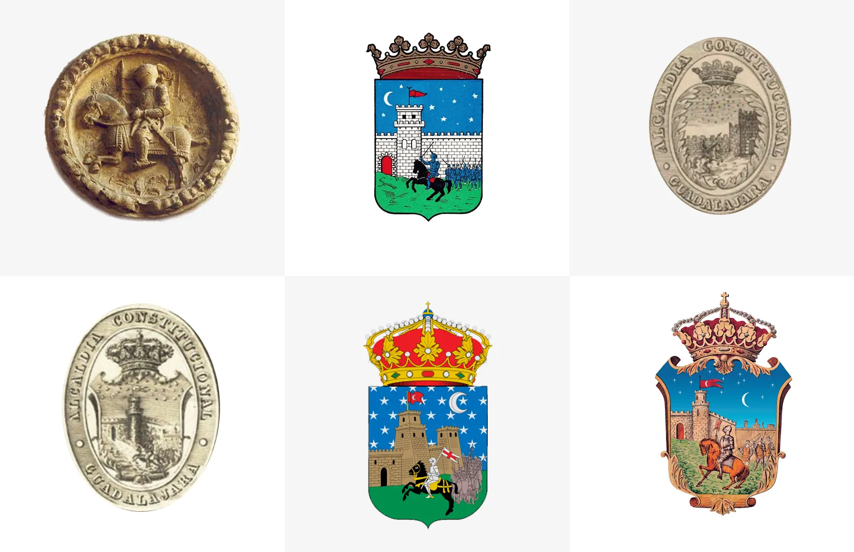
After centuries of Guadalajara using various unofficial versions of its coat of arms, we digitized the most widely recognized depiction to formalize it. Additionally, we developed a brandmark (isotype) that synthesizes its historical significance: the legend of the conquest of Guadalajara.
We thus established the digitized heraldic shield and the imagotype as the distinctive marks of the city and the City Council, respectively.
The project began with an extensive study of the shield’s history and the city’s sociological context. These findings were synthesized into a comprehensive visual system that constitutes the new brand identity.
RESEARCH
History and sociological context
We analyzed the legend of the conquest of Guadalajara (June 24, 1085) and the evolution of the heraldic shield, consulting historiographical sources and collaborating with local experts: archaeologist Ildefonso Ramírez and historian Ángel Mejía.
The design criteria integrated the idiosyncrasies of Guadalajara’s citizens. Our research concluded that there is a strong emotional bond with the heraldic shield and a widespread pragmatic character—a preference for the certainty of the explicit over the ambiguity of abstraction.
This analysis established the project’s axiom: the new visual identity had to avoid codes unrelated to the legend of Guadalajara, representing it in a manner more consistent with the city’s contemporary reality.
In doing so, we perpetuate and dignify the symbols that the community has embraced throughout the centuries.
LOGOTYPE
The legend of Guadalajara through three questions
We synthesized the shield into a contemporary, monochromatic brandmark based on the legend of the city’s conquest:
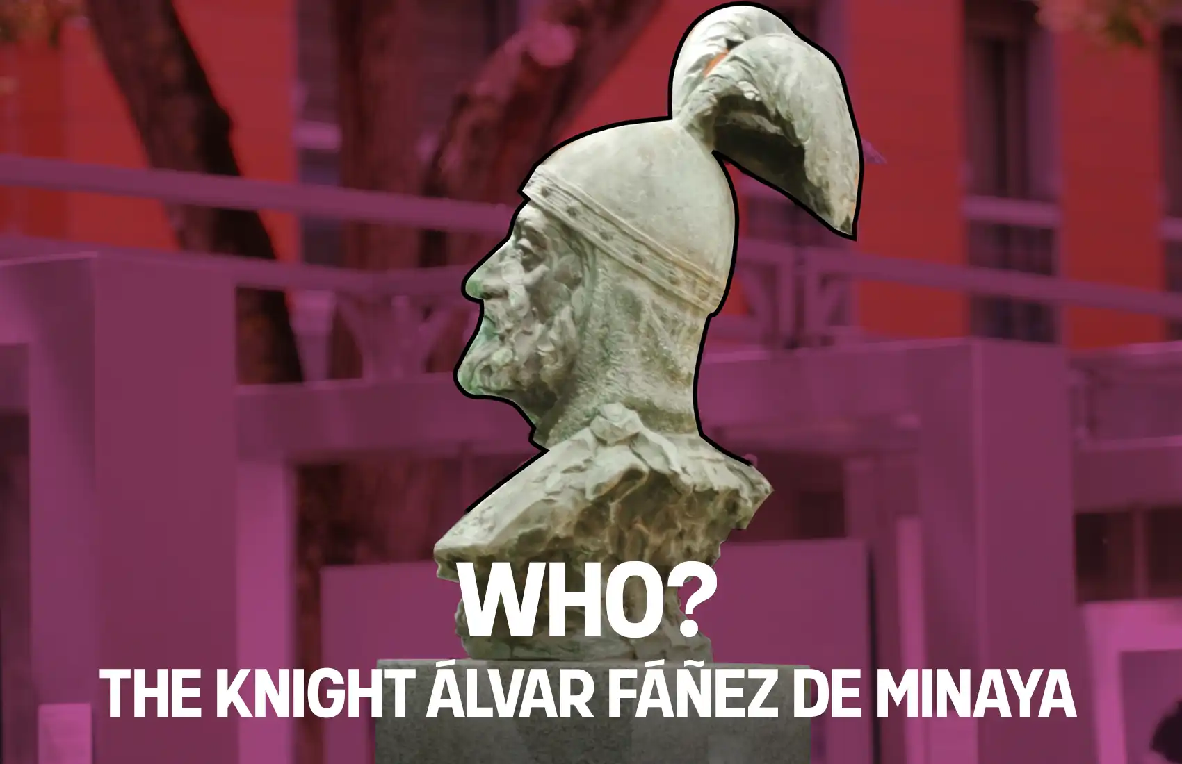
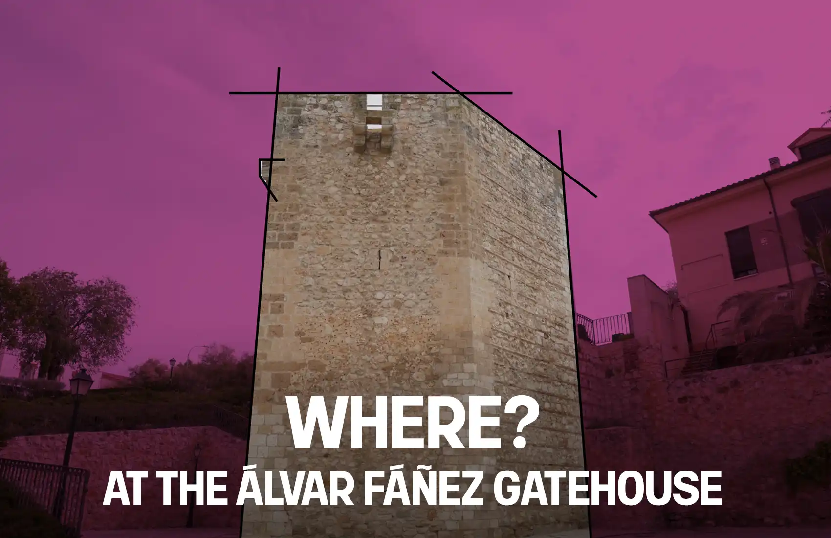
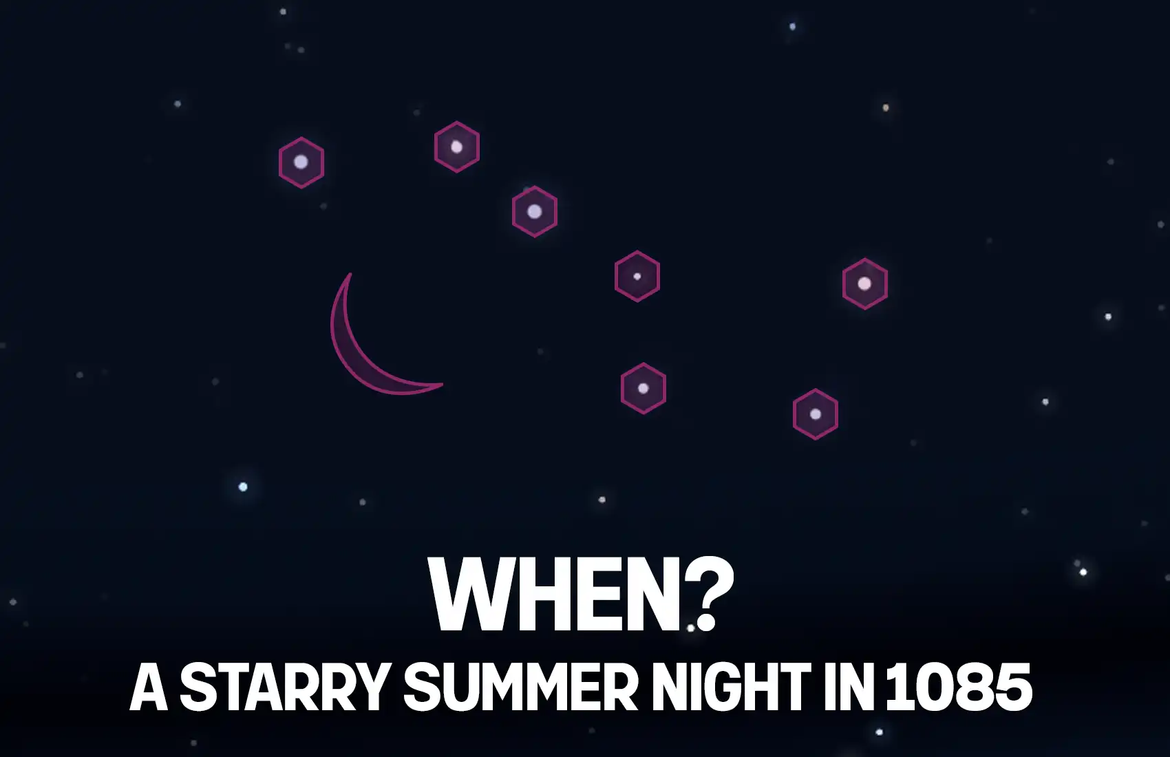
“Under the starry night of St. John in 1085, the knight Álvar Fáñez de Minaya employed a cunning strategy: shoeing his troops’ horses backward to mislead the enemy. They successfully infiltrated the area near the tower that now bears his name, remaining hidden until dawn to take the city once it was left unprotected.”
To translate this narrative into design, we established three fundamental coordinates: Who, Where, and When.
We utilized authentic local references:
- The Knight: The bust profile from his monument at Paseo de las Cruces.
- The Gatehouse: The silhouette of the Álvar Fáñez Gatehouse.
- The Sky: The Big Dipper constellation, widely recognized and representative of summer nights in the city.
LOGOTYPE
The legend of Guadalajara through three questions
We synthesized the shield into a contemporary, monochromatic brandmark based on the legend of the city’s conquest:
“Under the starry night of St. John in 1085, the knight Álvar Fáñez de Minaya employed a cunning strategy: shoeing his troops’ horses backward to mislead the enemy. They successfully infiltrated the area near the tower that now bears his name, remaining hidden until dawn to take the city once it was left unprotected.”
To translate this narrative into design, we established three fundamental coordinates: Who, Where, and When.
We utilized authentic local references:
- The Knight: The bust profile from his monument at Paseo de las Cruces.
- The Gatehouse: The silhouette of the Álvar Fáñez Gatehouse.
- The Sky: The Big Dipper constellation, widely recognized and representative of summer nights in the city.


STRUCTURE AND COMPOSITION
To convey solidity, stability, and institutional trust, we implemented two compositional strategies:
- Geometric Balance: The gatehouse’s silhouette was derived from low-angle photography (ground level). This causes the wall lines to converge upward, creating a stable, near-triangular shape.
- Baseline: The composition rests on an invisible horizontal baseline supporting the tower, the knight, and the typography. To maintain this stability, the lowercase “j” was modified, shortened, and raised.
Regarding color, influenced by the city’s historical purple, we selected a reddish-purple (Pantone 242 C) that conveys rigor and stability. This shade also reconnects with the historical roots of ancient Castilian banners, which were predominantly red and turned purple over time due to the aging of the pigment.
VISUAL SYSTEM
City, architecture, and territory
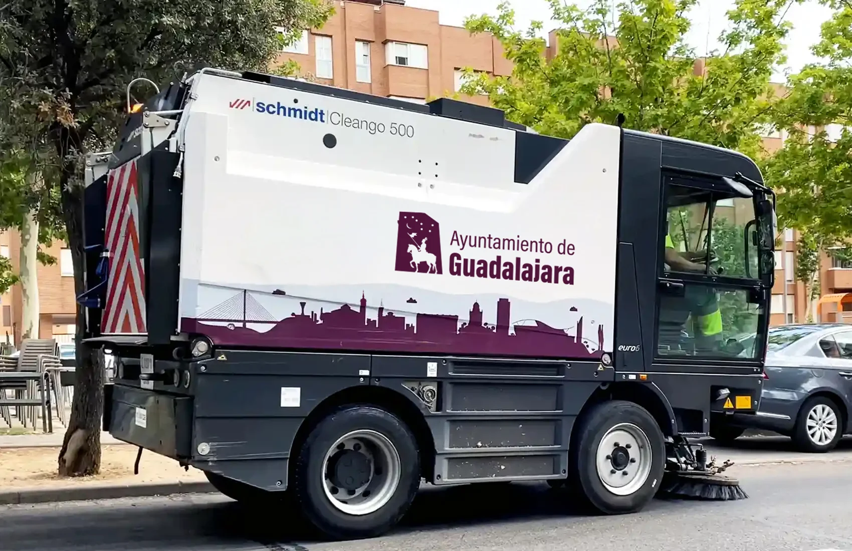
We developed a Guadalajara skyline that balances singular buildings, local topography, residential areas, and the city’s high density of green spaces through the integration of trees.
This graphic system has been implemented across the municipal cleaning fleet, public buildings, and digital platforms.
Private Sector Adoption: Local television uses it as a backdrop for the program “La tarde con Cristina,” and the city’s largest construction firm (Hercesa) has integrated it into promotional materials for a major urban development.
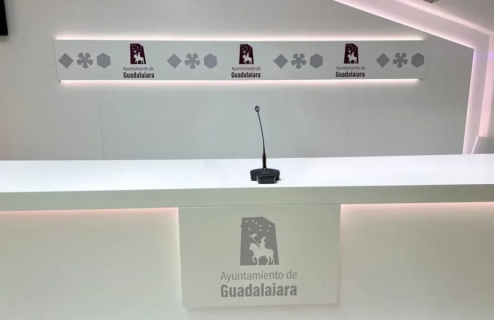
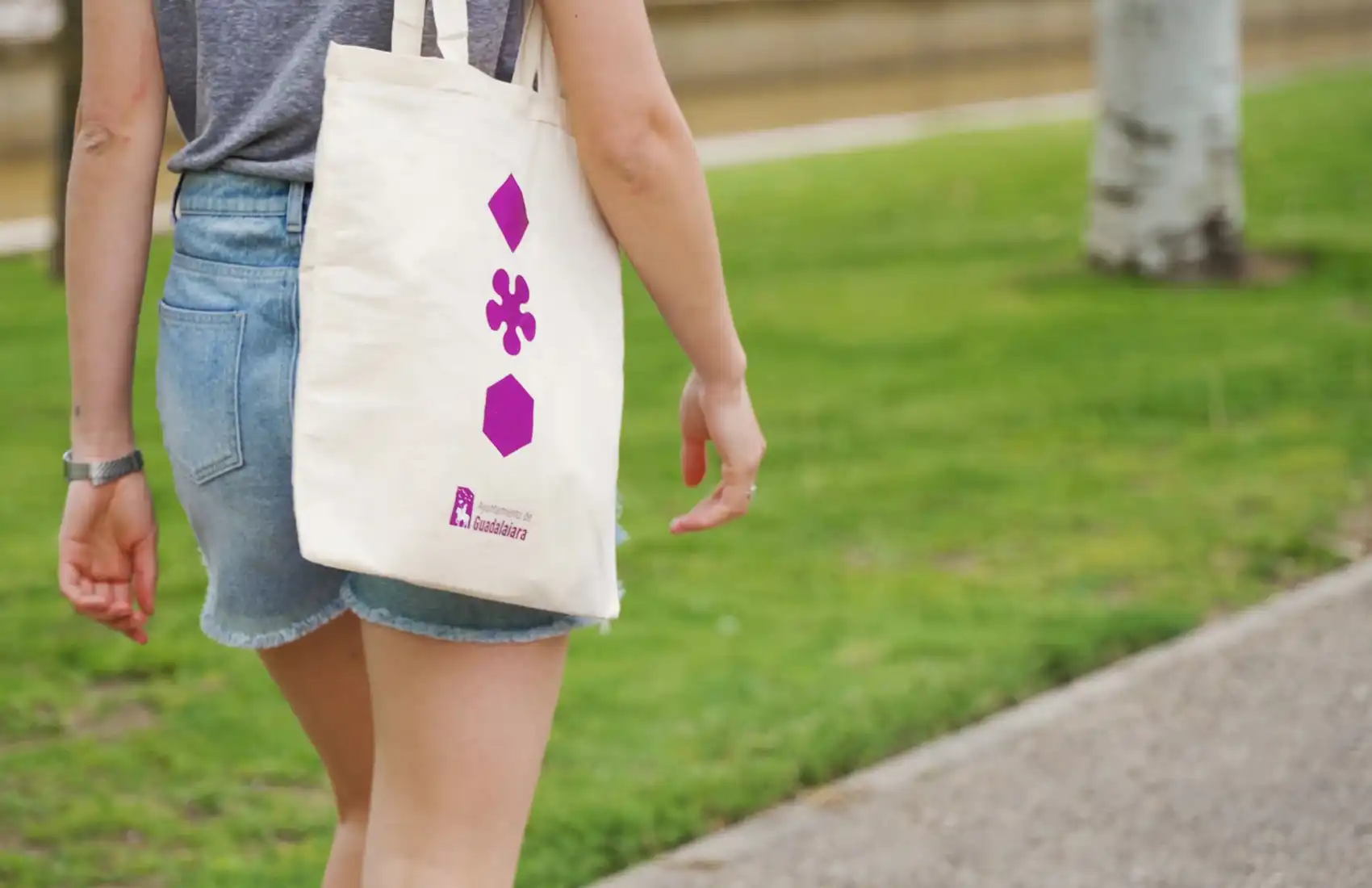
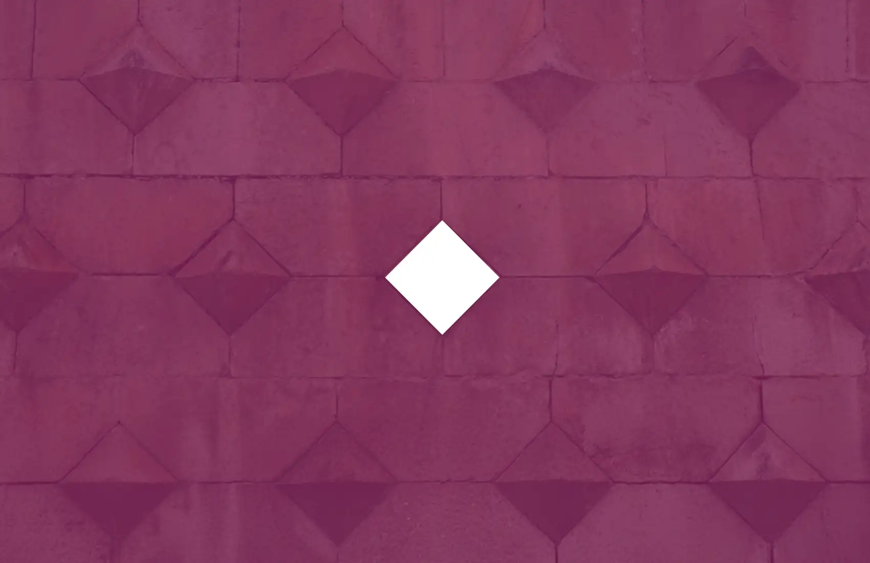
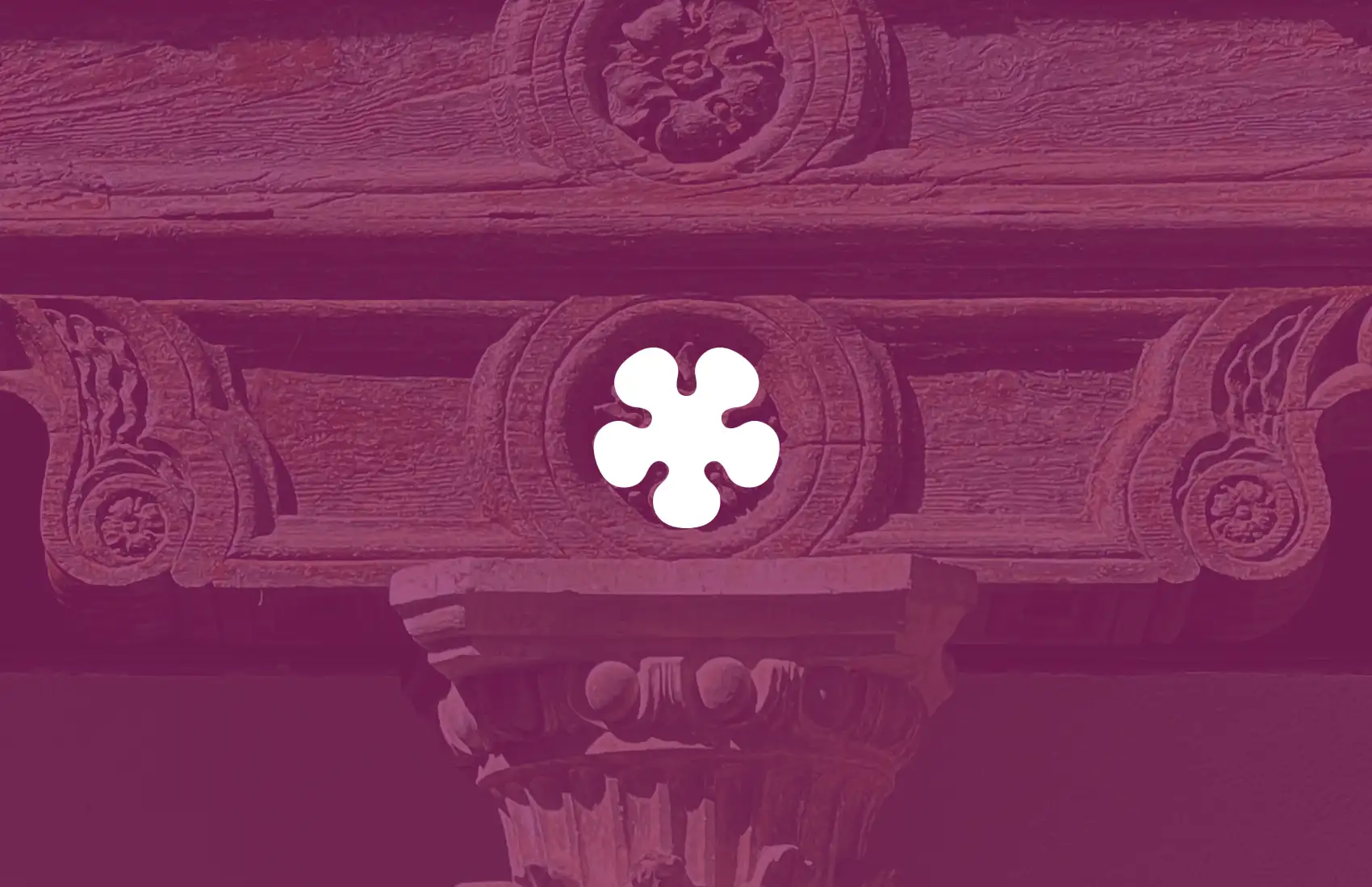
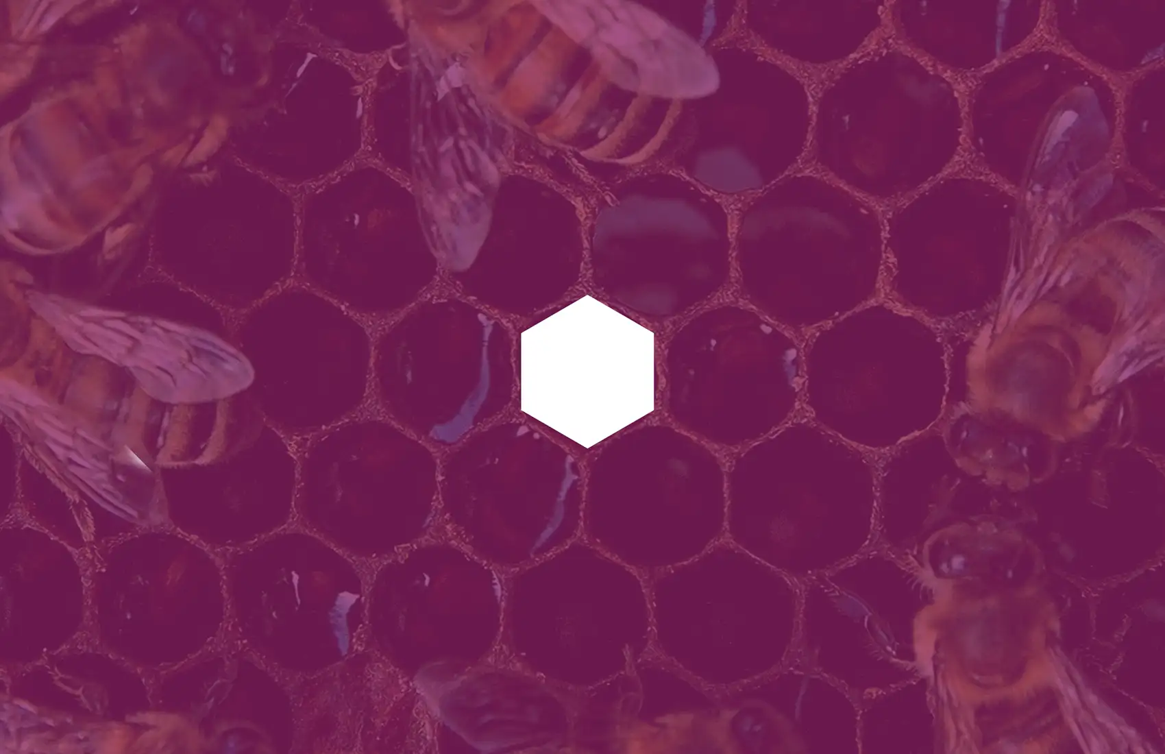
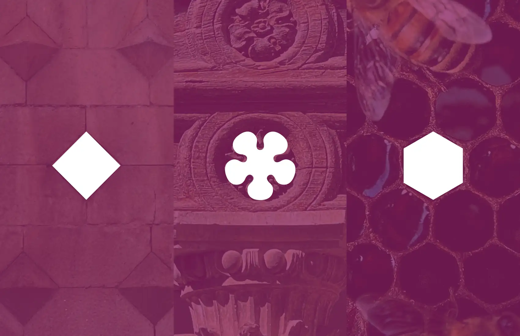
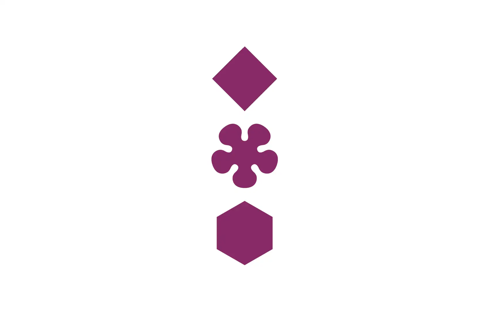
As graphic ornaments, we geometrically synthesized icons of the city and the Alcarria region:
- The diamond-point rustication of the Infantado Palace represented by a rhombus.
- The Mendoza family heritage is represented by the flower motif found in buildings designed by Alonso de Covarrubias.
- The beekeeping tradition is represented by a hexagon.


VISUAL SYSTEM
City, architecture, and territory
We developed a Guadalajara skyline that balances singular buildings, local topography, residential areas, and the city’s high density of green spaces through the integration of trees.
This graphic system has been implemented across the municipal cleaning fleet, public buildings, and digital platforms.
Private Sector Adoption: Local television uses it as a backdrop for the program “La tarde con Cristina,” and the city’s largest construction firm (Hercesa) has integrated it into promotional materials for a major urban development.
As graphic ornaments, we geometrically synthesized icons of the city and the Alcarria region:
- The diamond-point rustication of the Infantado Palace represented by a rhombus.
- The Mendoza family heritage is represented by the flower motif found in buildings designed by Alonso de Covarrubias.
- The beekeeping tradition is represented by a hexagon.
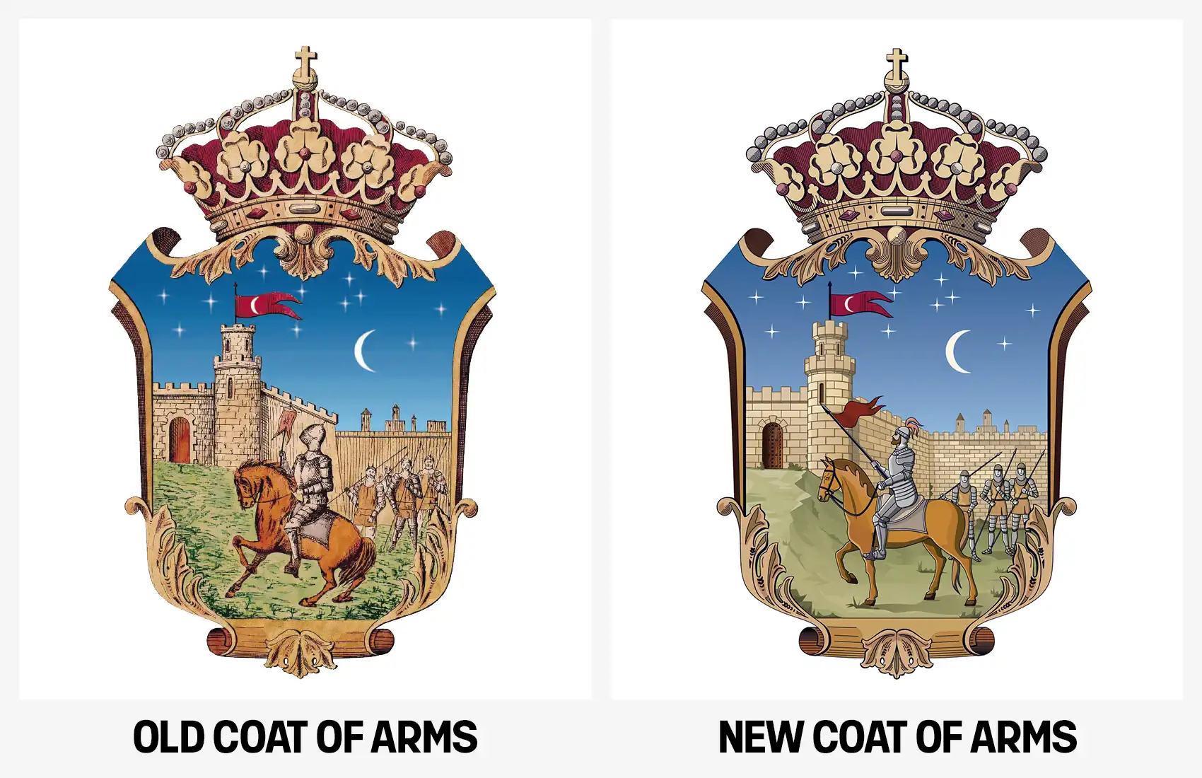
HERALDIC SHIELD
Updating and digitizing a centennial emblem
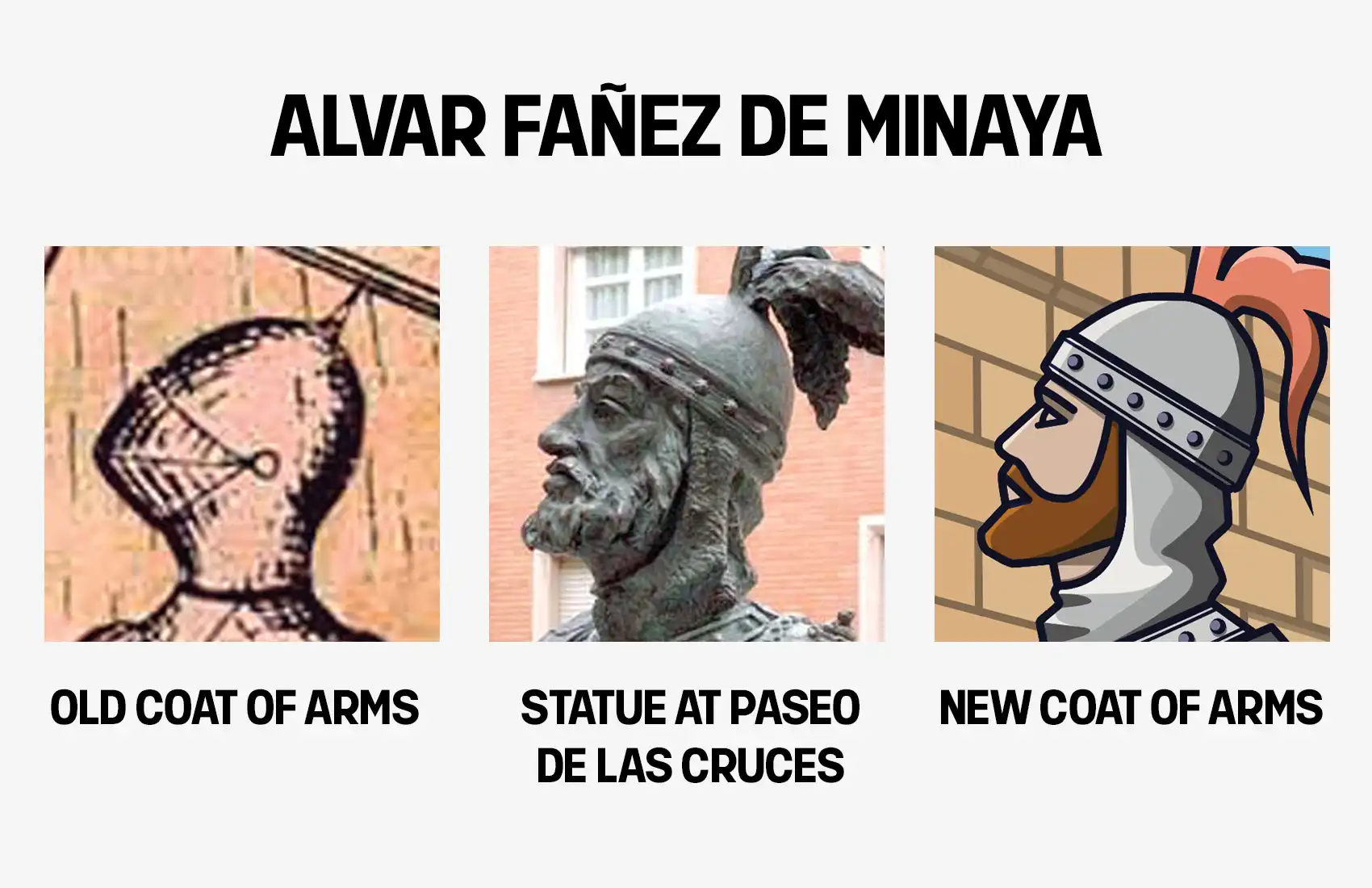
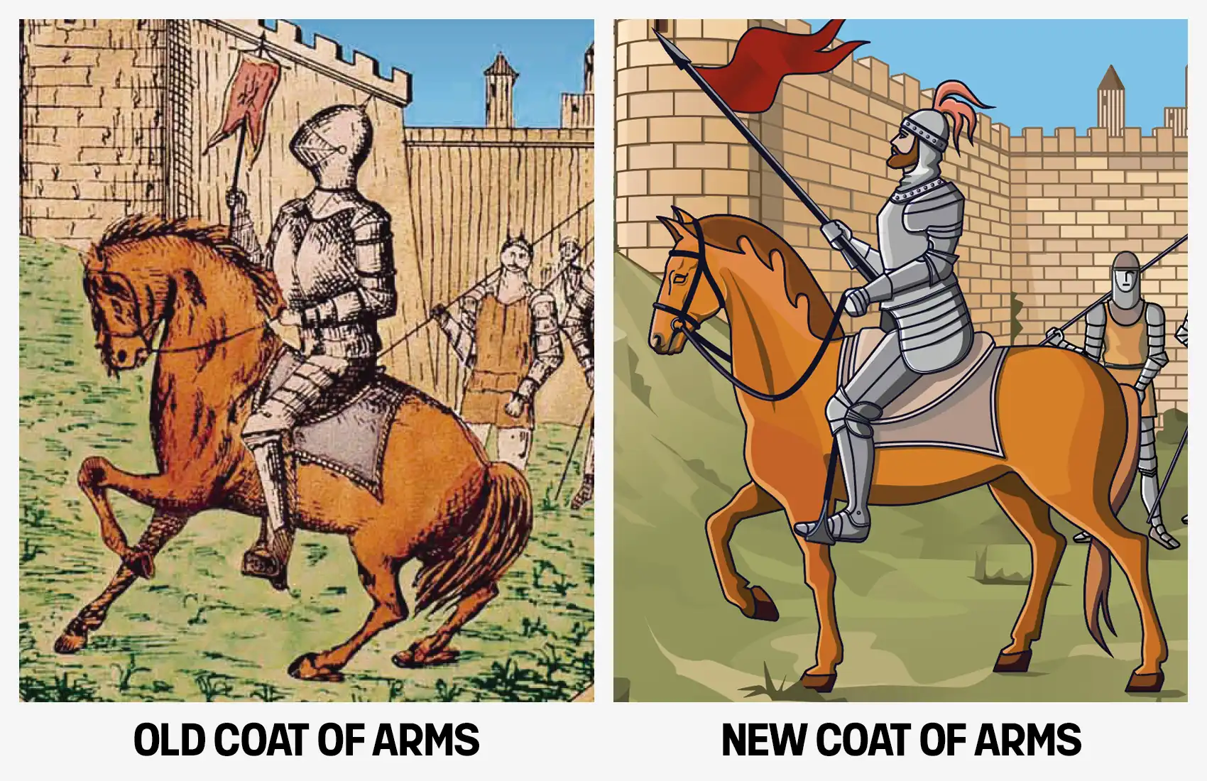
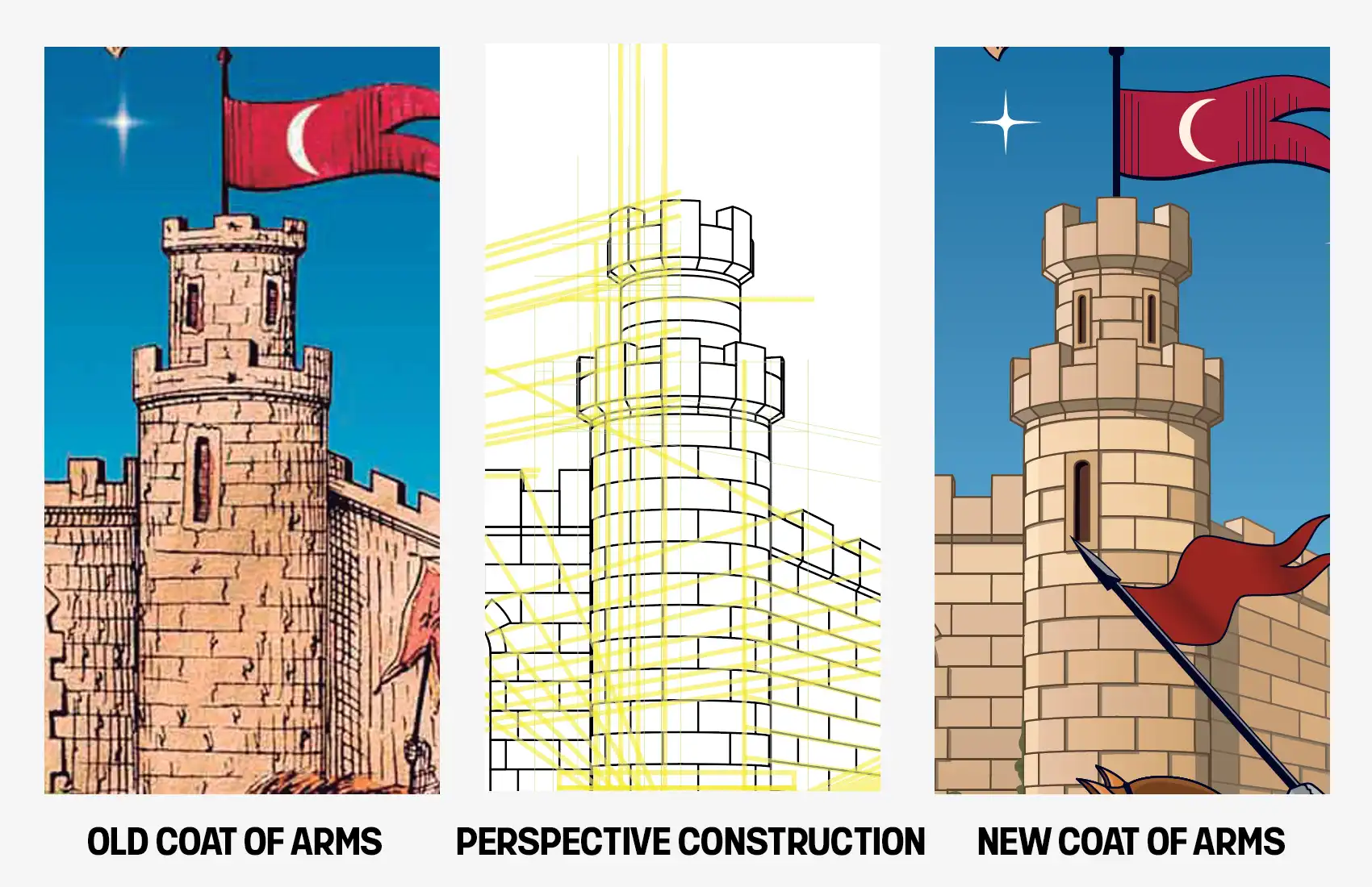
Given the existence of multiple unofficial versions of the shield, we vectorized the most common representation, applying the following technical adjustments:
- The bust of Álvar Fáñez now aligns with the sculpture at Paseo de las Cruces.
- Proportions between the knight and the horse were balanced.
- While maintaining the knight’s authority, the stance was shifted from a bellicose to a peaceful one, reflecting two realities: the strategic nature of the 1085 conquest and the current peaceful coexistence of its citizens.
- Perspective was perfected by calculating vanishing points.
- The crown and heraldic scroll were redrawn for symmetry.
HERALDIC SHIELD
Updating and digitizing a centennial emblem
Given the existence of multiple unofficial versions of the shield, we vectorized the most common representation, applying the following technical adjustments:
- The bust of Álvar Fáñez now aligns with the sculpture at Paseo de las Cruces.
- Proportions between the knight and the horse were balanced.
- While maintaining the knight’s authority, the stance was shifted from a bellicose to a peaceful one, reflecting two realities: the strategic nature of the 1085 conquest and the current peaceful coexistence of its citizens.
- Perspective was perfected by calculating vanishing points.
- The crown and heraldic scroll were redrawn for symmetry.
PRESENTATION AND LAUNCH
The new corporate identity was unveiled during an official presentation to institutions and the media on June 24, 2021—coinciding exactly with the anniversary of the conquest legend. The event was held at the Huerta de San Antonio Park, adjacent to the Álvar Fáñez Gatehouse.
The launch featured a three-dimensional reproduction of the new brandmark, physically embodying the brand’s transition into its new era.
CONSOLIDATION AND VALIDITY
2021-2026
Five years after its implementation, the seamless adoption of the visual system by both the institution and the public validates a design rooted in historical rigor and local identity.
Its structural conception ensures a timeless quality, recently recognized with a Bronze at the 2026 Indigo Design Awards; an accolade that confirms its aesthetic relevance according to contemporary international standards.
CONSOLIDATION AND VALIDITY
(2021-2026)
Five years after its implementation, the seamless adoption of the visual system by both the institution and the public validates a design rooted in historical rigor and local identity.
Its structural conception ensures a timeless quality, recently recognized with a Bronze at the 2026 Indigo Design Awards; an accolade that confirms its aesthetic relevance according to contemporary international standards.