FADETA

Brand Design Corporate Website Illustration Photography

Comprehensive redesign to strengthen territorial cohesion.
We developed a new corporate identity supported by original illustration and photography, distilling the geography of the Tajo–Tajuña region into a geometric and structural visual language.

The project comes to life through a dual digital ecosystem: a corporate site focused on institutional communication, and an immersive tourism portal designed to highlight the region’s heritage and natural landscape.

Corporate website

TOURISM WEBSITE

ALCARRIA

NATURA

Brand Design Illustration Photography Video Production

Brand Identity Direction and Execution for Alcarria Natura, lavender growers and distillers. Our objective: to transform a local business into a structured, scalable brand.

Through a comprehensive redesign of their identity, packaging, and visual strategy, we have supported the brand during its physical expansion and the exponential growth of its e-commerce performance, consolidating its nationwide presence.

LOGO

BOTANICAL SYNTHESIS: THE LAVENDER CALYX AS THE MINIMAL UNIT

The visual system is derived from the morphological synthesis of the lavender flower and the representation of the calyx—the biological capsule that contains the essential oil.

From this unit, we developed a parameterized isotype. Its exterior curvature is not arbitrary; it is governed by a sequence of tangent circles whose dimensions correspond to the golden ratio. A mathematical abstraction that captures the botanical essence with technical rigor.

MODULAR SYSTEM AND CATEGORIZATION

The base isotype functions as a living module that structures the entire product architecture, facilitating visual identification:

Lavender Line

The module is repeated three times along the vertical axis, replicating the original flower spike. It is applied to amber glass for essential oils and white packaging for derived products.

Lavandin line

A structural adaptation to botanically differentiate hybrids (Abrial, Super, and Grosso). We reduced the height to two levels and expanded the base to four calyces, utilizing blue glass for immediate categorization.

Aroma Brihuega

We elevated the visual system by rotating the module in four directions to form a rosette with a central cross. This identity dresses a complex fragrance developed exclusively for Alcarria Natura, merging botany with the local history of the town of Brihuega, wrapped in a deep blue palette, gold foil stamping, and a geometric mesh.

Jabón de Brihuega

A sub-brand focused on traditional hand soap production using artisanal techniques. The logo coexists with honest kraft paper packaging, wrapped in a dark label that enhances readability and accentuates contrast.

Guadalajara

Green

Brand Design Corporate Website Photography Video Production

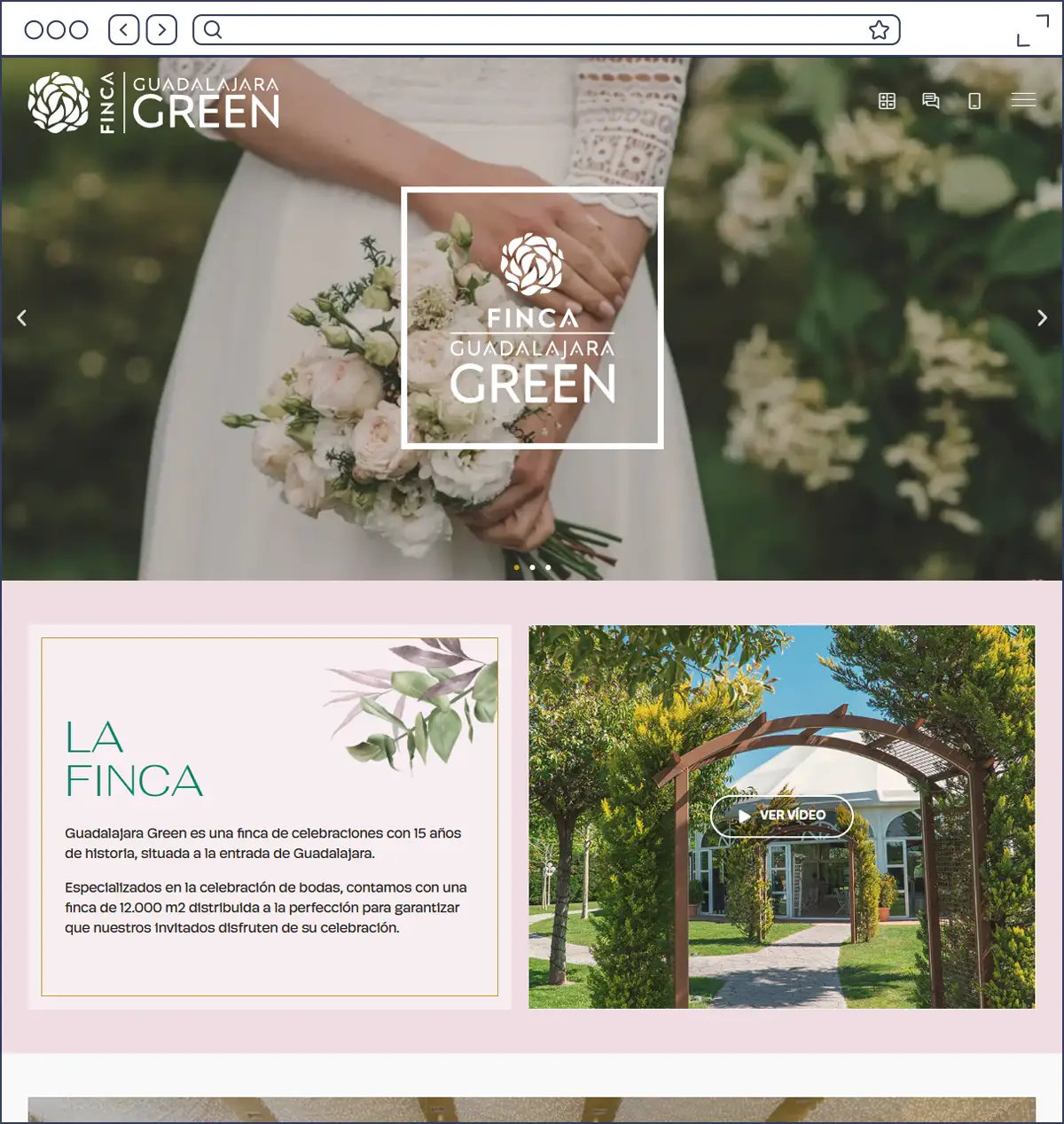
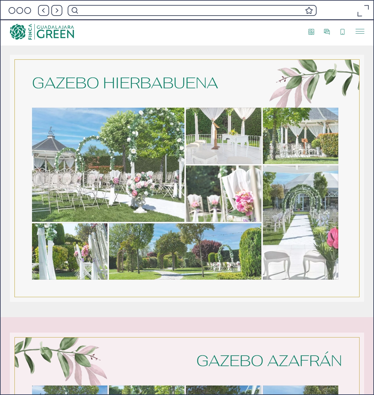
Since 2018, we have acted as Guadalajara Green’s outsourced design department. The project began with the development of their comprehensive corporate identity – a design that remains fully effective and relevant eight years later.
Throughout this period, we have developed and applied their brand across the following areas:

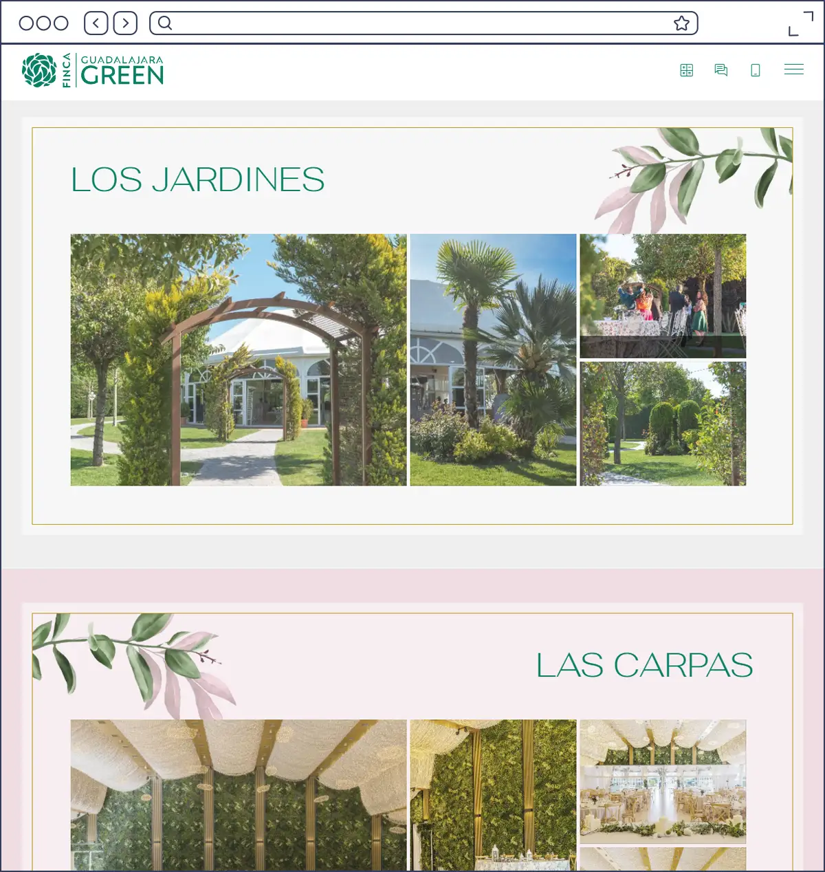
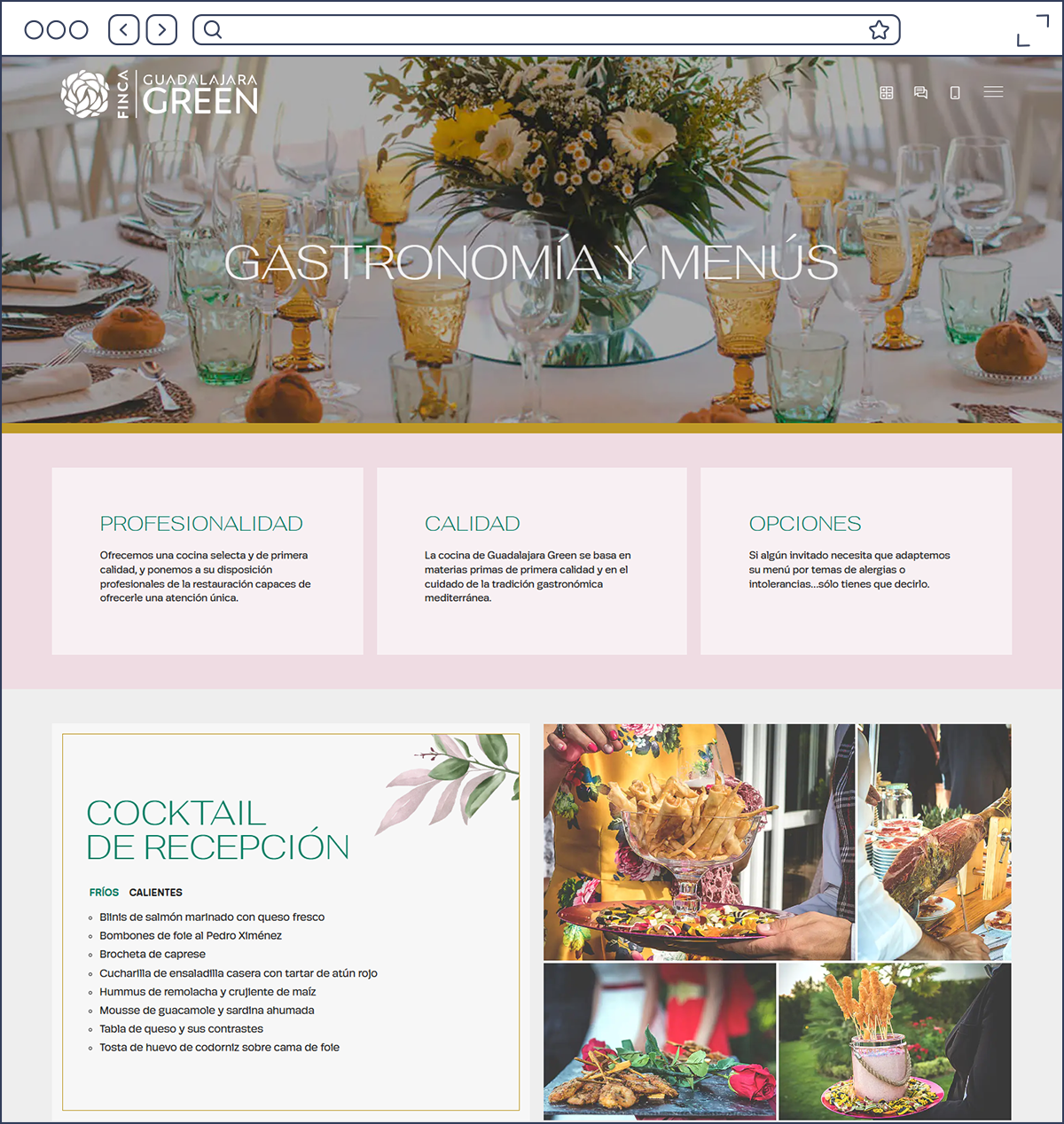
  • Digital Ecosystem: Design and development of their web platform, iterating from an initial version to the current digital environment.
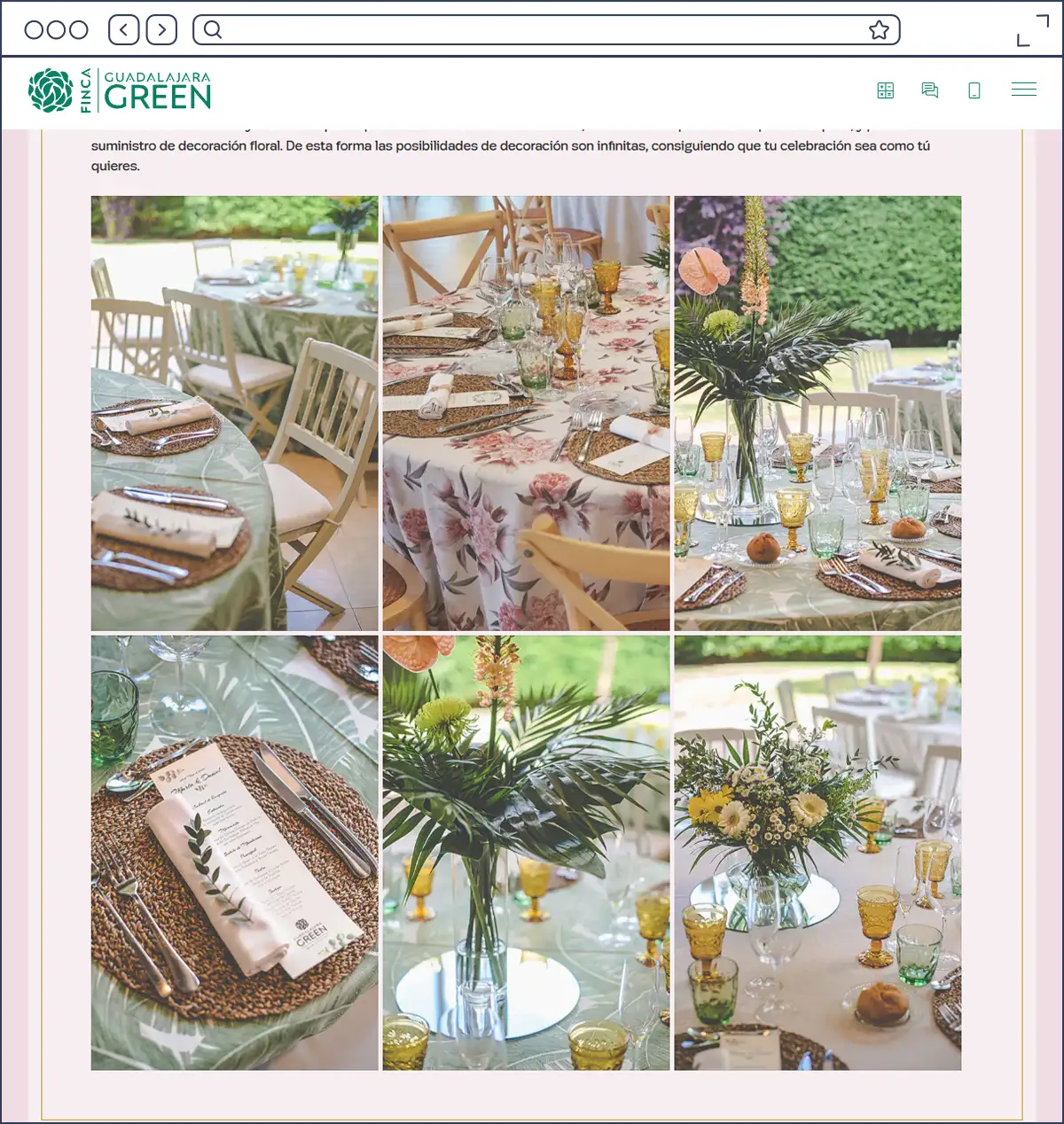
  • Audiovisual Production: Photography features and video shoots for their various communication channels.
  • Commercial Strategy: Service catalog design and ad campaign management across both physical media and digital platforms (Meta Ads).

GUADALAJARA GREEN
CORPORATE WEBSITE