We developed a Guadalajara skyline that balances singular buildings, local topography, residential areas, and the city’s high density of green spaces through the integration of trees.
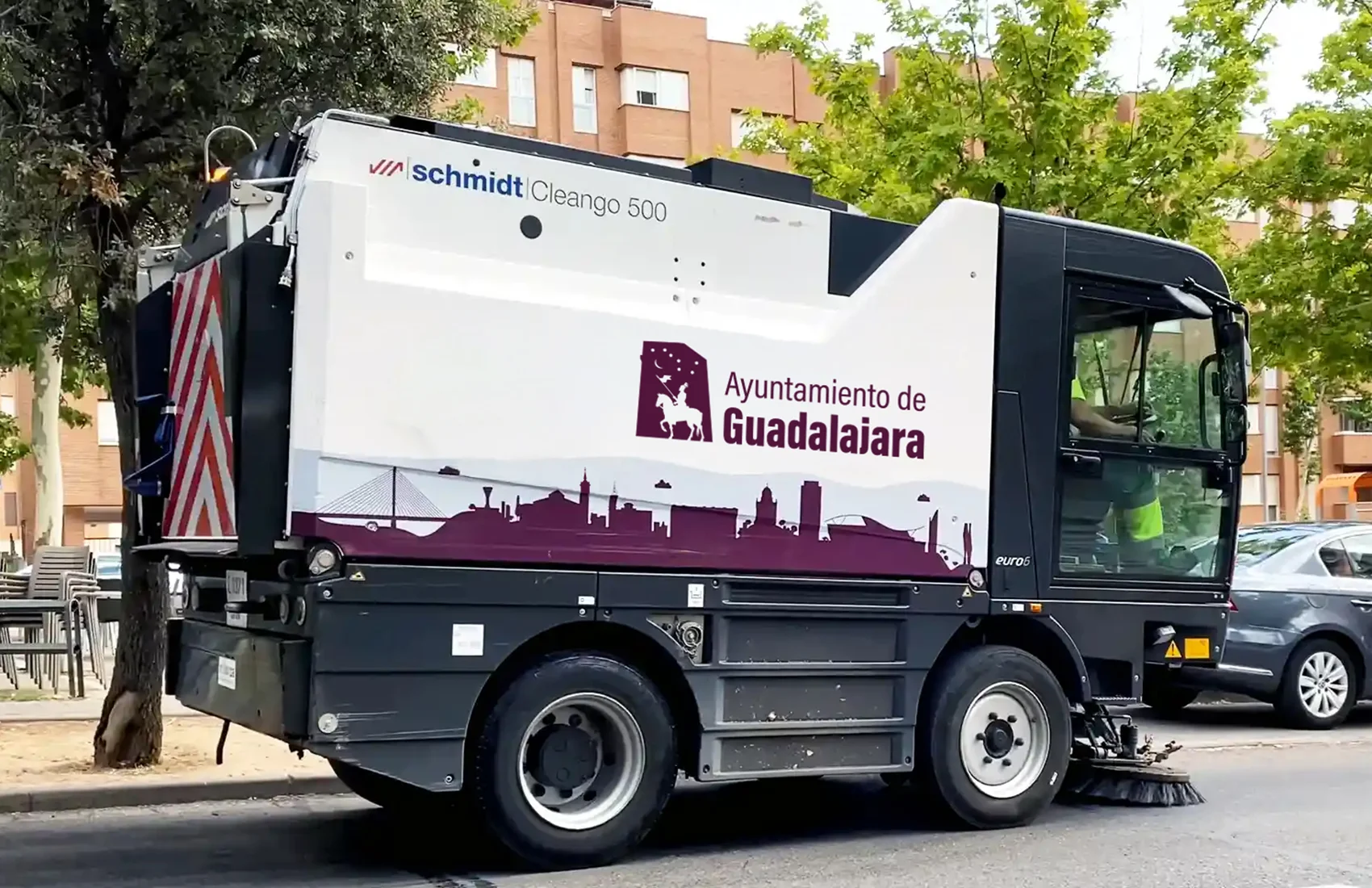
This graphic system has been implemented across the municipal cleaning fleet, public buildings, and digital platforms.
Private Sector Adoption: Local television uses it as a backdrop for the program “La tarde con Cristina,” and the city’s largest construction firm (Hercesa) has integrated it into promotional materials for a major urban development.
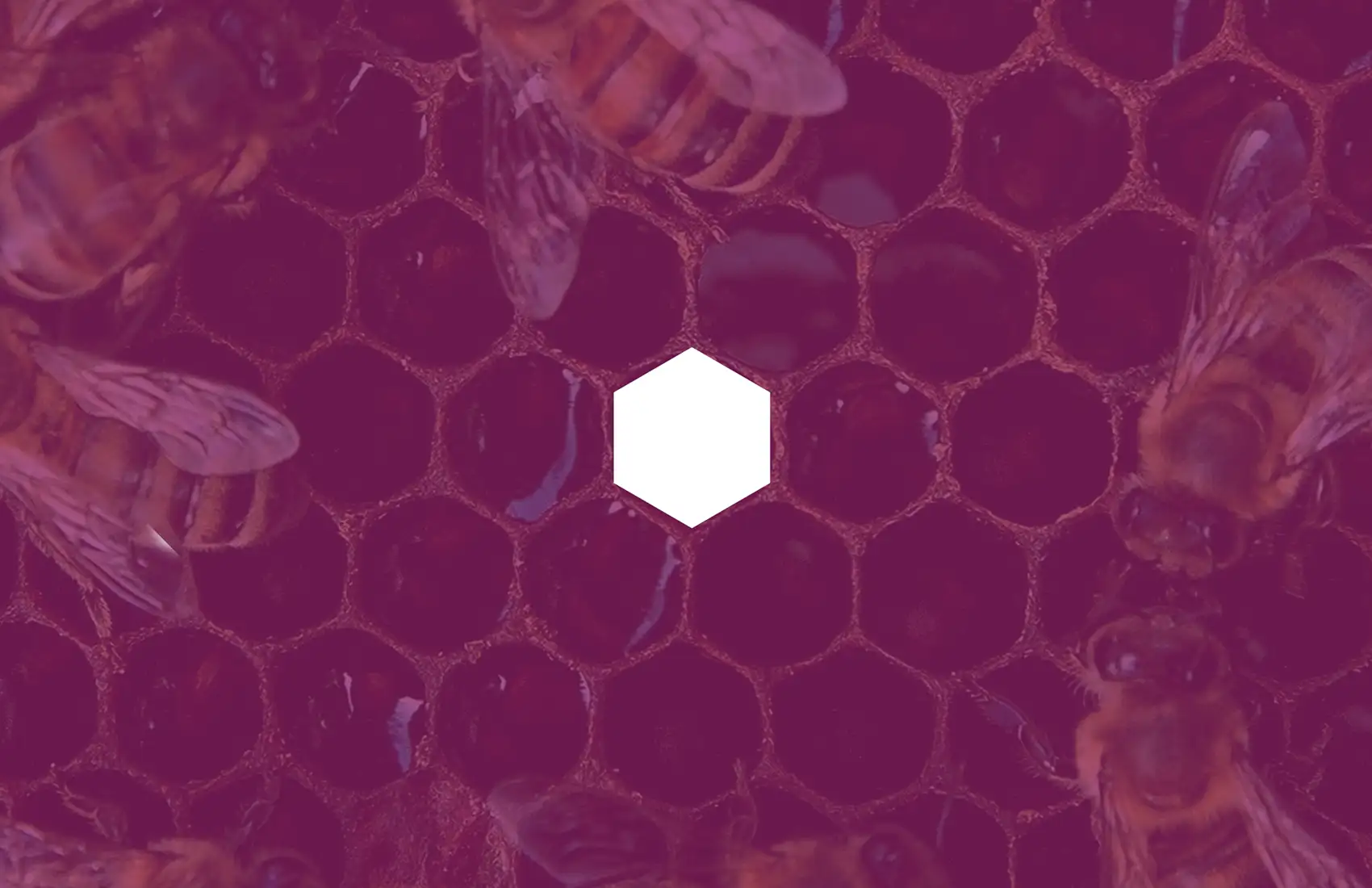
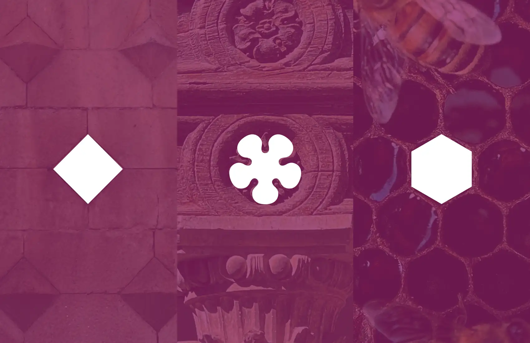
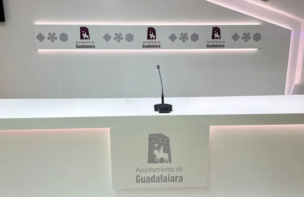
As graphic ornaments, we geometrically synthesized icons of the city and the Alcarria region:
- The diamond-point rustication of the Infantado Palace represented by a rhombus.
- The Mendoza family heritage is represented by the flower motif found in buildings designed by Alonso de Covarrubias.
- The beekeeping tradition is represented by a hexagon.


